Basics

1. LOGO

The logo can be used in colour, white, and black. The white version on a coloured background is preferred.

The use of the colour logo on coloured surfaces or photos is not permitted. The same applies to placing a white area on a coloured surface or graphic.
The required clear space around the logo is equal to one-third of the logo’s height.
This also applies to coloured backgrounds.

1.1. LOGO and FRAME-DESIGN

The spacing around the logo must be equal to one-third of the height of the logo frame. This applies to both the top and the sides.

The preferred use of the logo is on a steel blue background.

If the line runs over a lighter area/image and is therefore difficult to see, the colour changes to blue.

NOTE: The line thickness is always the same as the line thickness of the logo frame.

When using the coloured logo on a white background, use steel blue for the frame line.
When using a black and white version, the logo is black and the line is also black. If the line runs over a darker image and is therefore difficult to see, the colour changes to white.

2. FONT

The house font News Cycle is sans serif, modern and timeless. It is characterized by good legibility and clarity.

3. COLOURS

The preferred colour is steel blue. The colour codes are defined as follows.

STEEL BLUE

CMYK: 50/10/0/50
RGB: 83/121/144
Hex: #537990

Steel blue can also be used in gradations (10 %).

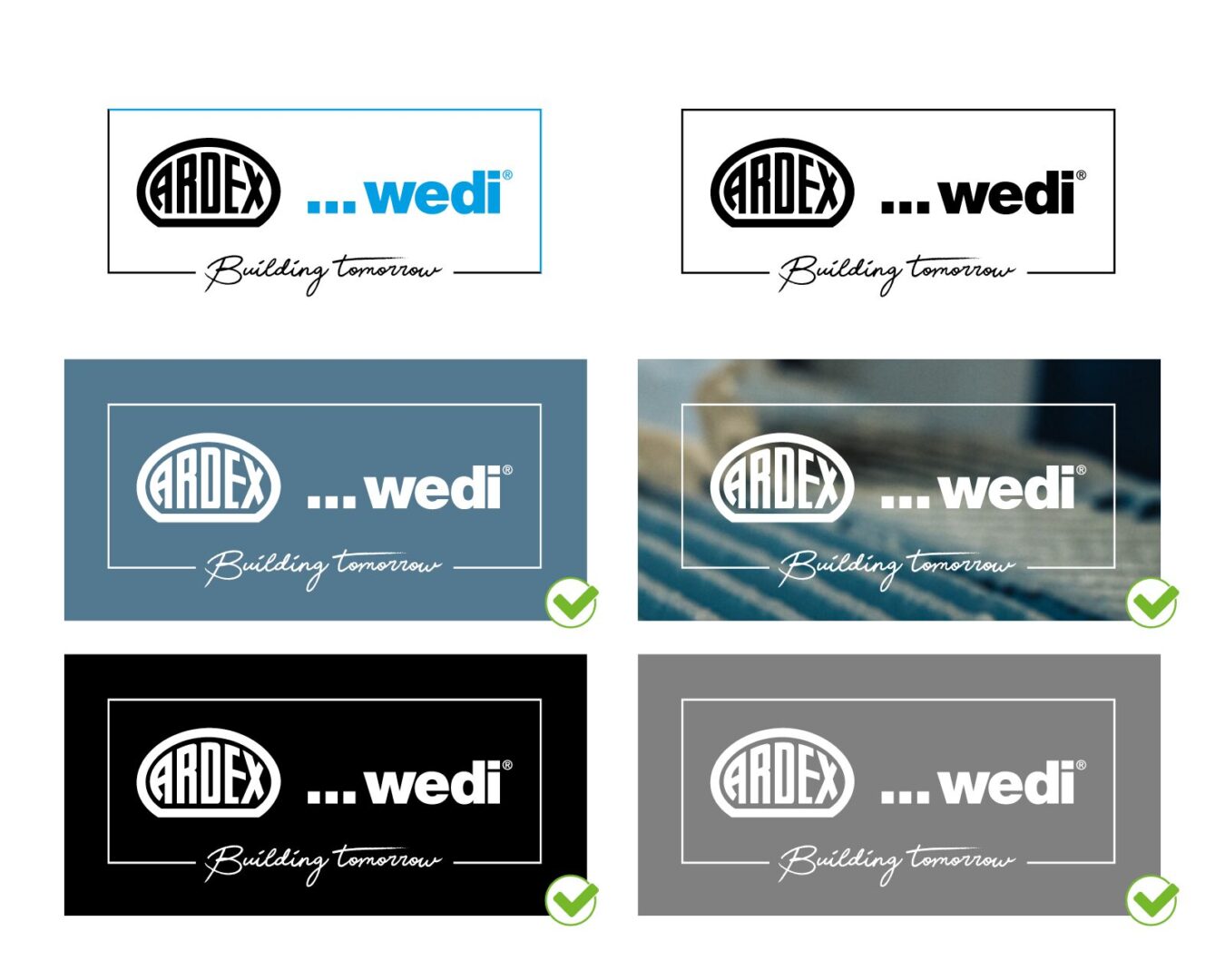
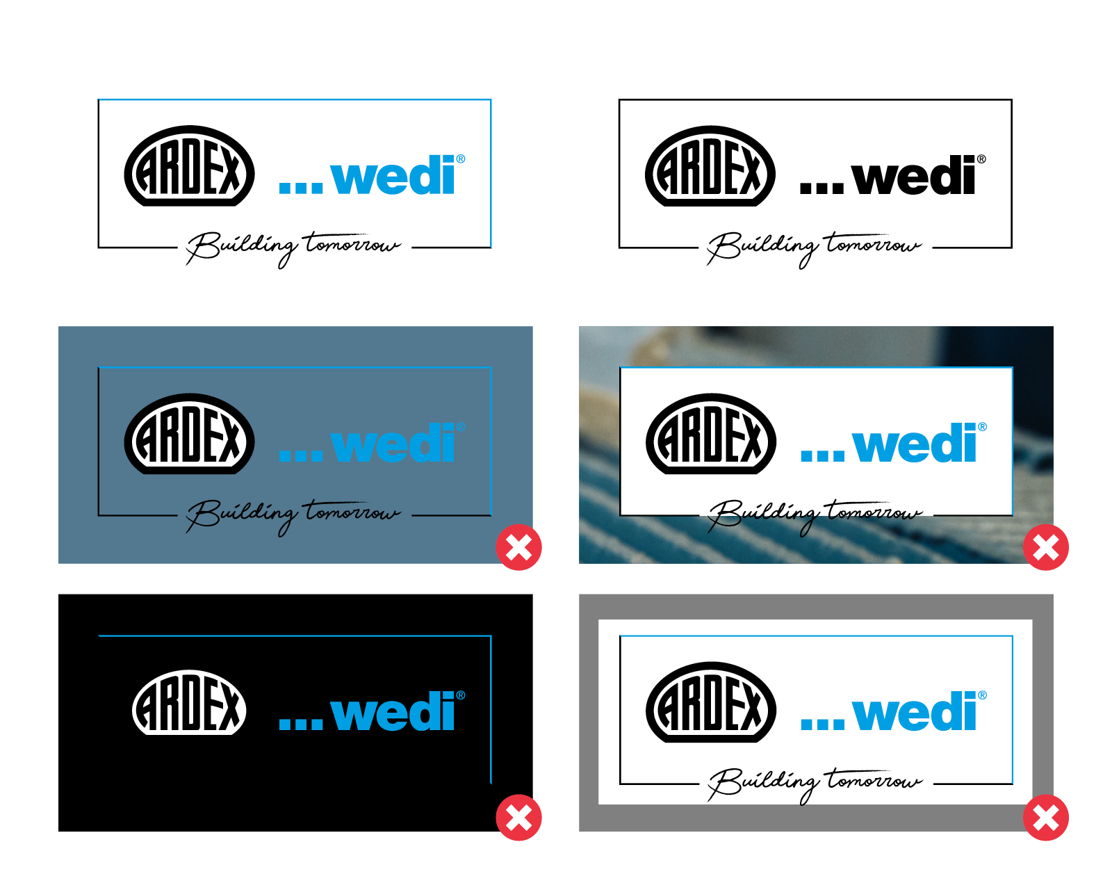
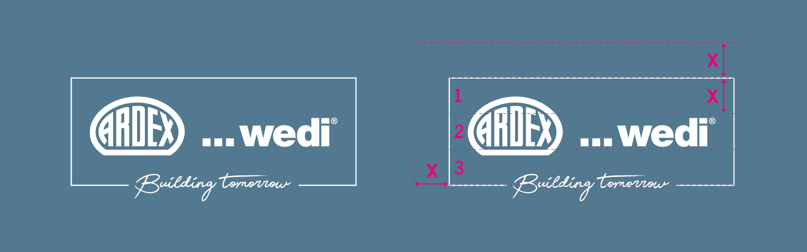
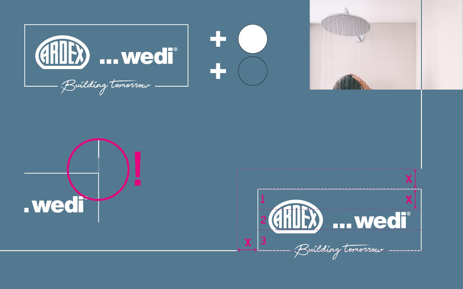
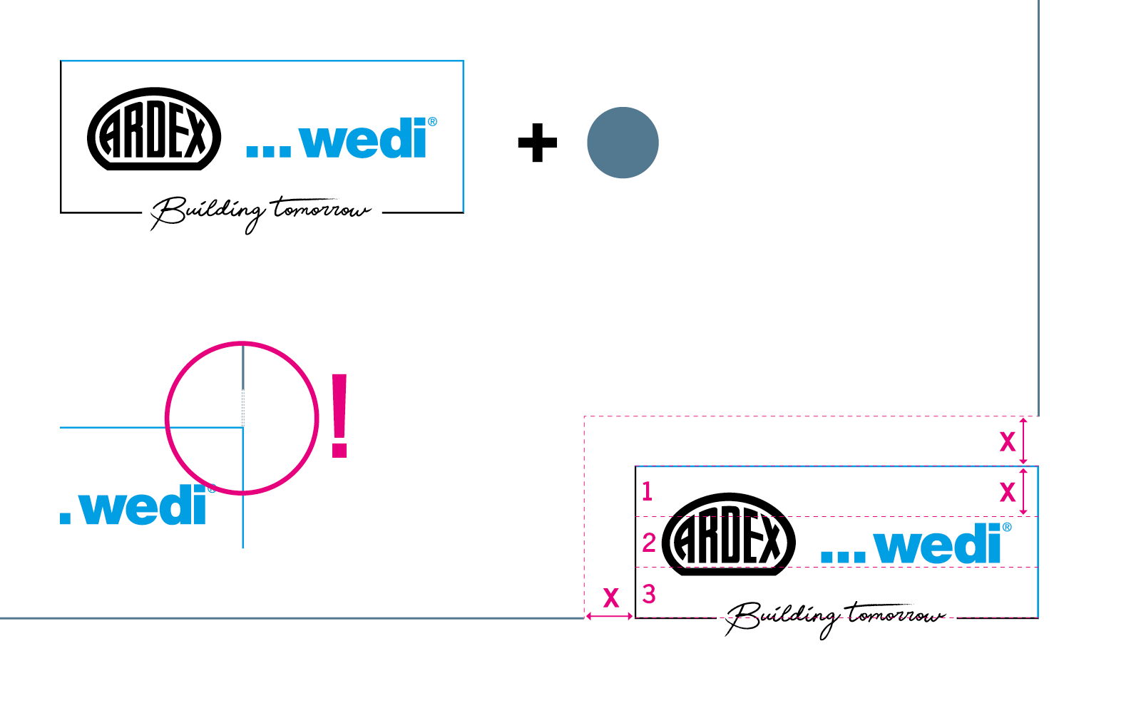
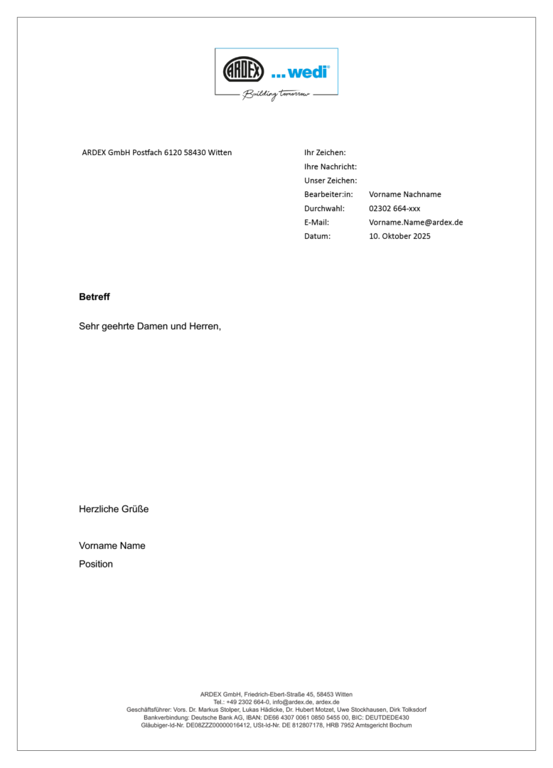
4. Layout Business Stationery

This section shows the components of the basic business stationery.

4.1. Layout Letterhead

The letterhead is available as a digital Word template and must be of course, individually customized before use.

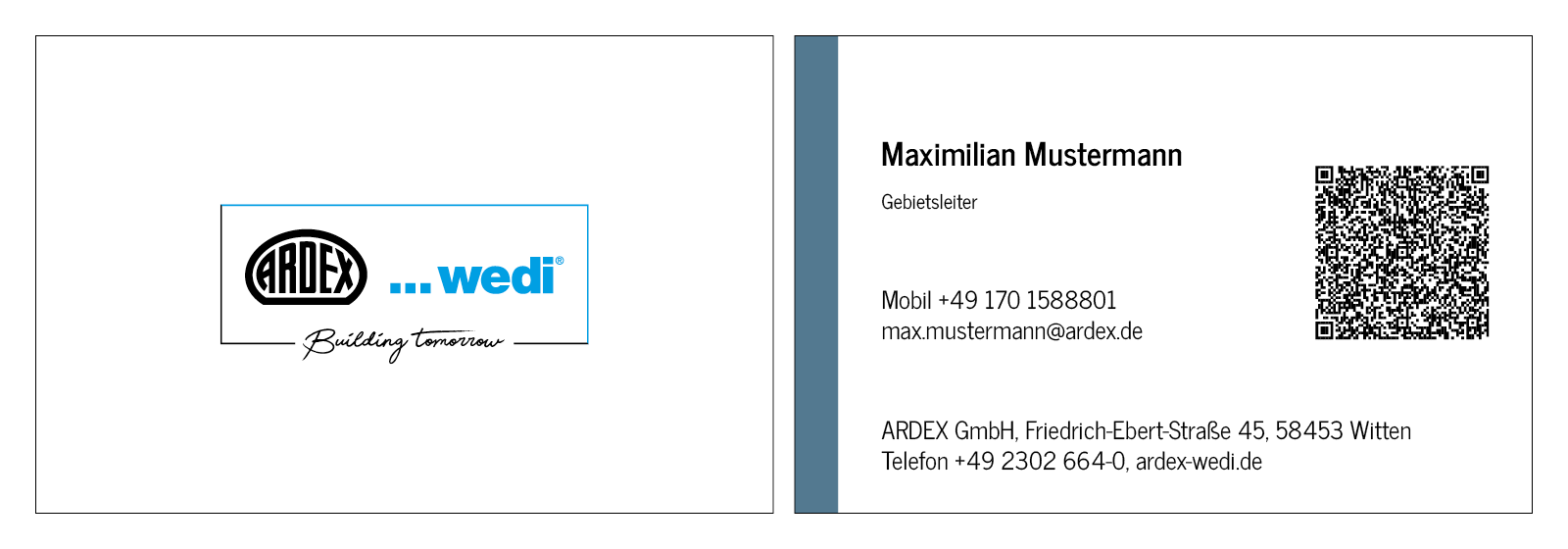
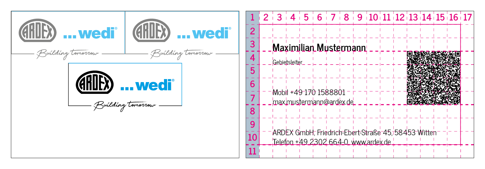
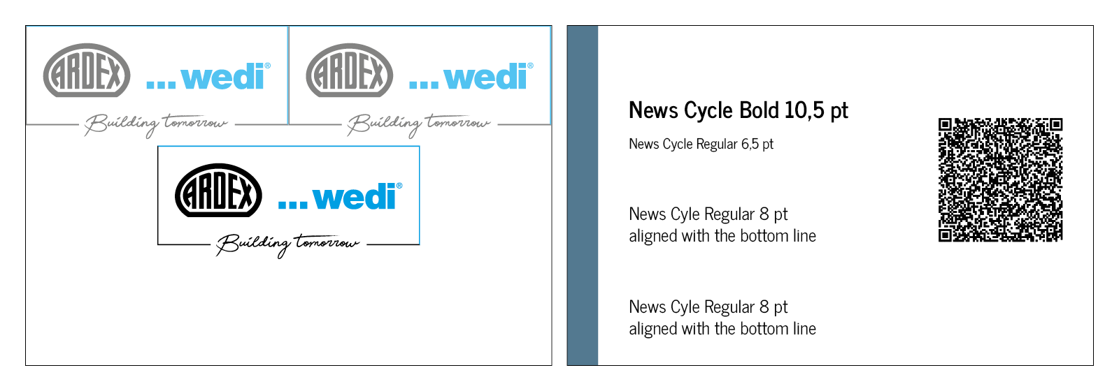
4.2. Layout Business card

Two logos spread across the width of the surface give the size of the logo.
The page with the information is divided into 5×5 mm boxes.

The coloured area on the left-hand side is one box wide and extends across the entire height of the business card.

Additionally, to the coloured area there is a safe space all around with a height and width of one box.

The QR code contains the personal data of the aforementioned person and has to be customized.

Please refer to the graphic for the font sizes.

5. Layout Advertisement

The high proportion of images in the advertisement is intended to attract attention and interest.

5.1. Layout Advertisement DIN A4

A clear and easily legible headline quickly informs the viewer about the intended use of the product depicted. A subline and a short explanatory text round off the provision of more detailed information.

There is a save area of 15 mm all around. The width of the logo corresponds to 1/3 of the design area. The distance between the lines and the logo corresponds to 1/3 of the height of the logo frame. The design area is divided into 8 large areas. In the lower area, these are divided again in half.

The image proportion is variable – depending on the text proportion – but always adapted to the grid.
Please refer to the graphic for font sizes.

5.2. Layout Advertisement Landscape format

DIN A5 Landscape

Landscape 99 x 100 mm

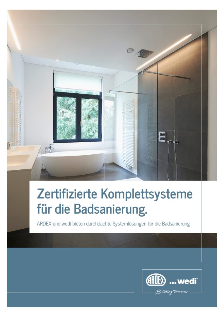
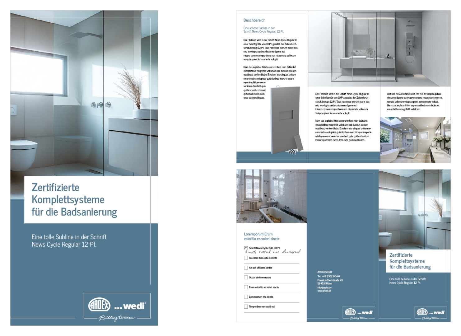
6. LAYOUT BROCHURE DESIGN

In the brochure, the proportion of images is greater than the proportion of text (on coloured areas).

The title of the brochure should be easy to read thanks to the font size and should be as short as possible. The accompanying subline serves to provide further explanations.

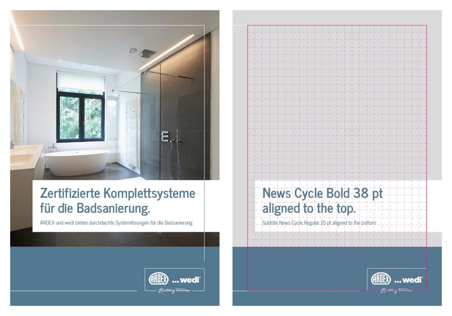
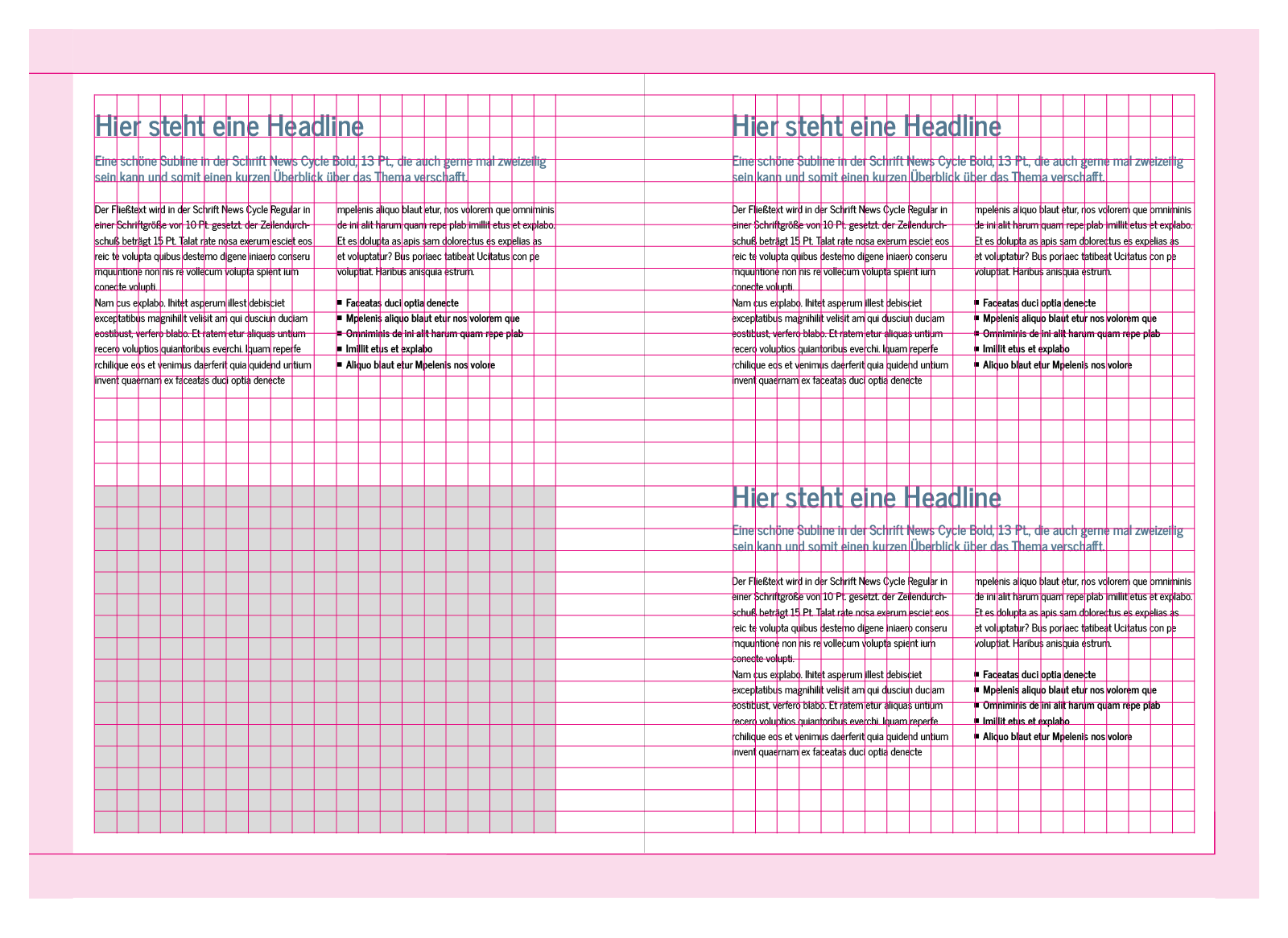
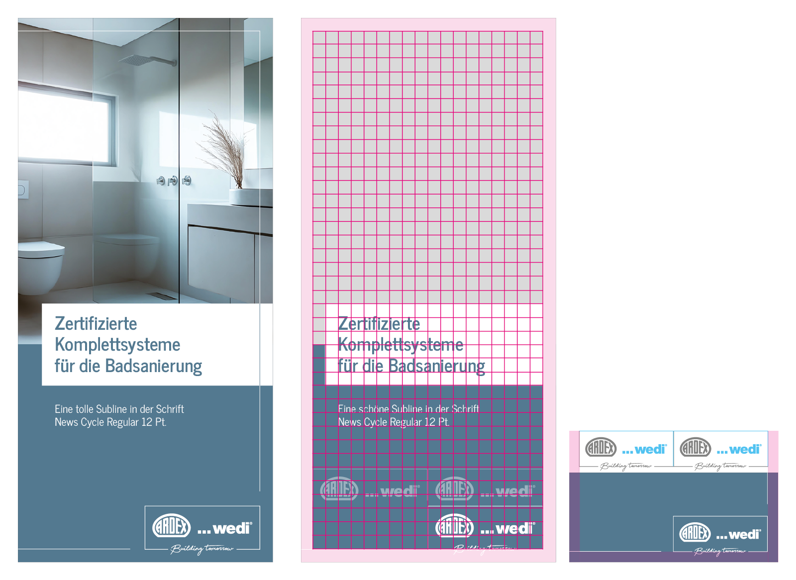
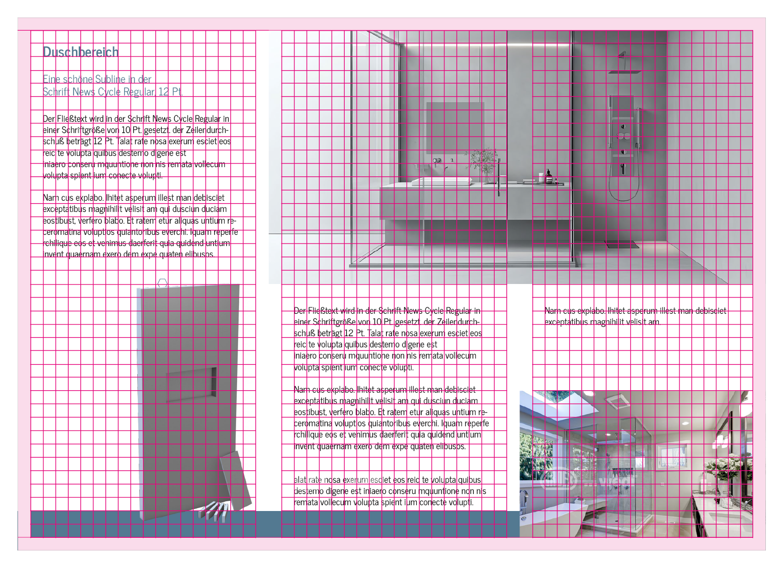
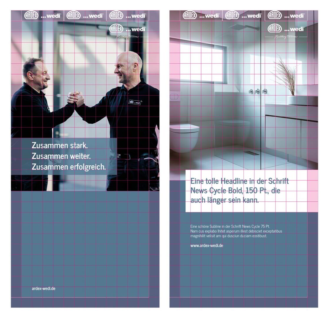
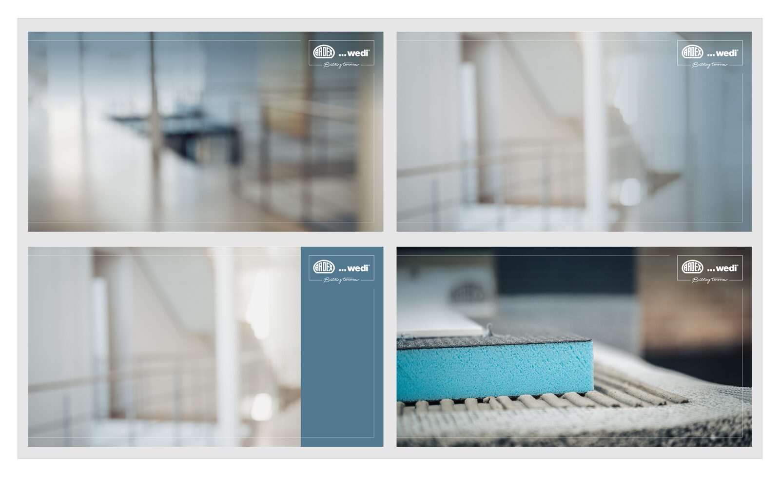
On the inside pages, there is a safe space around the edge formed by the frame.
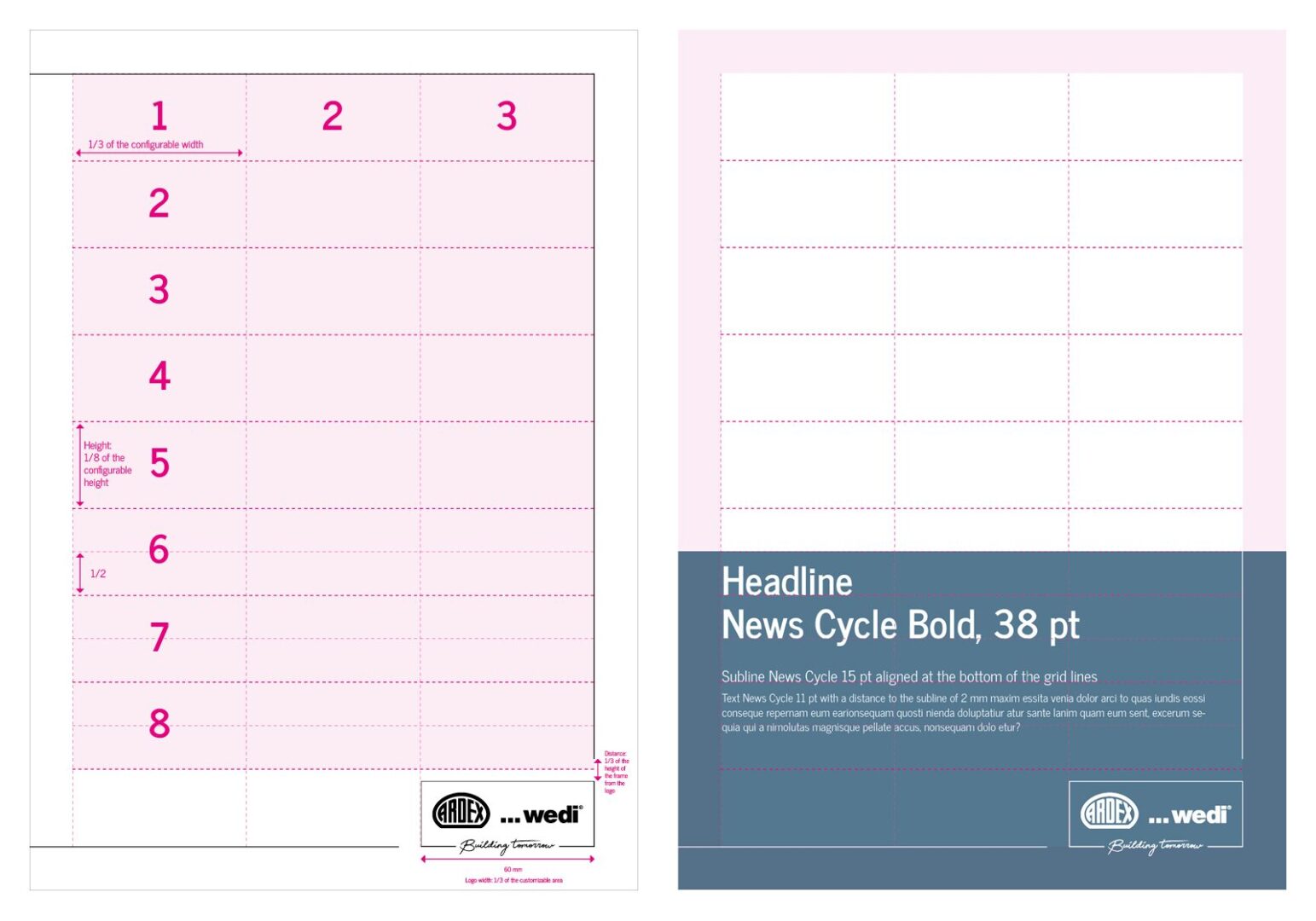
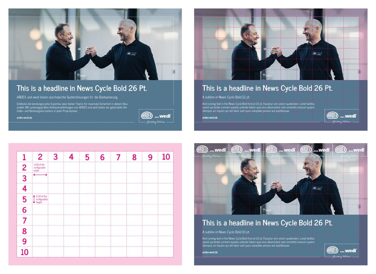
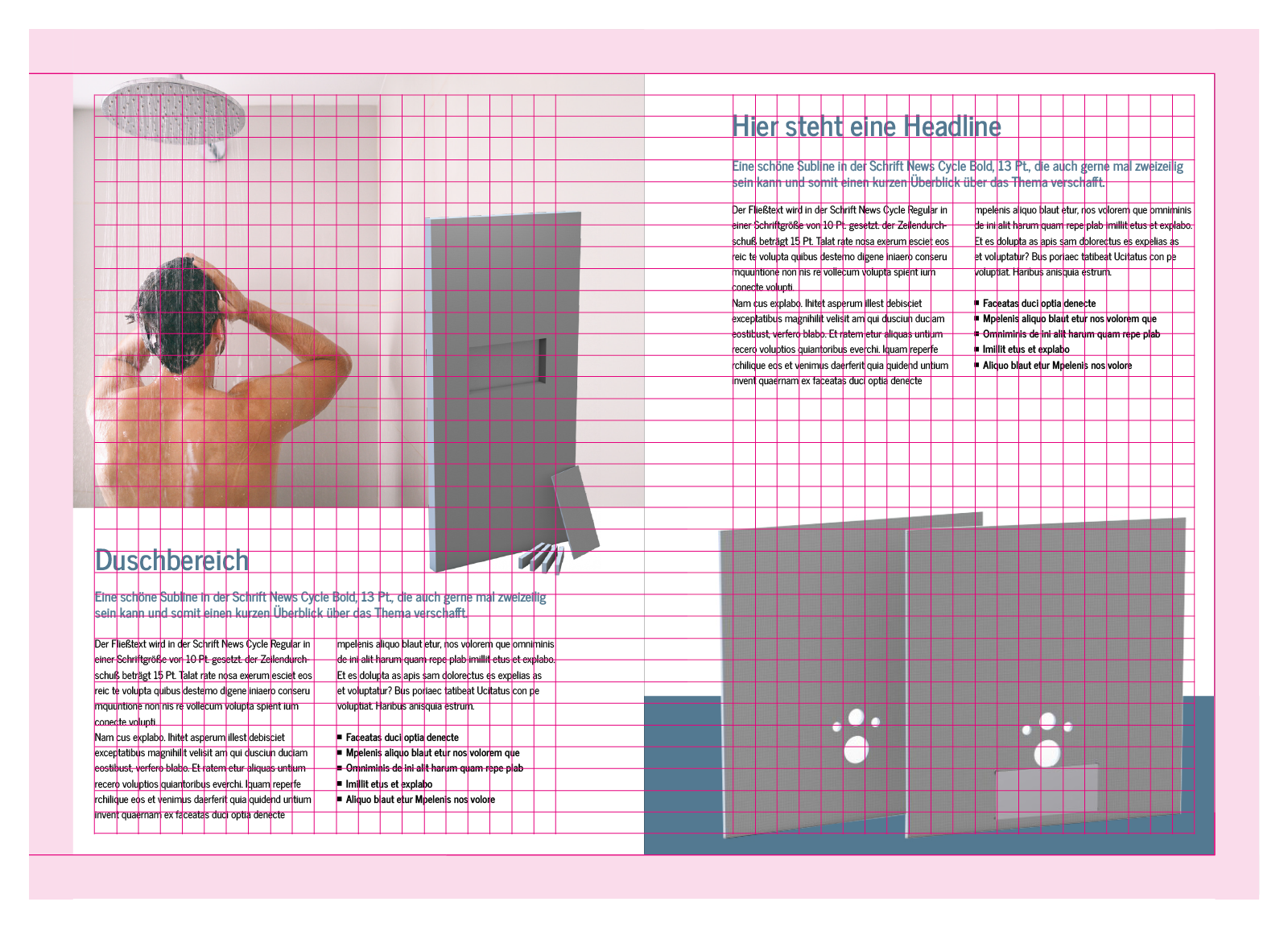
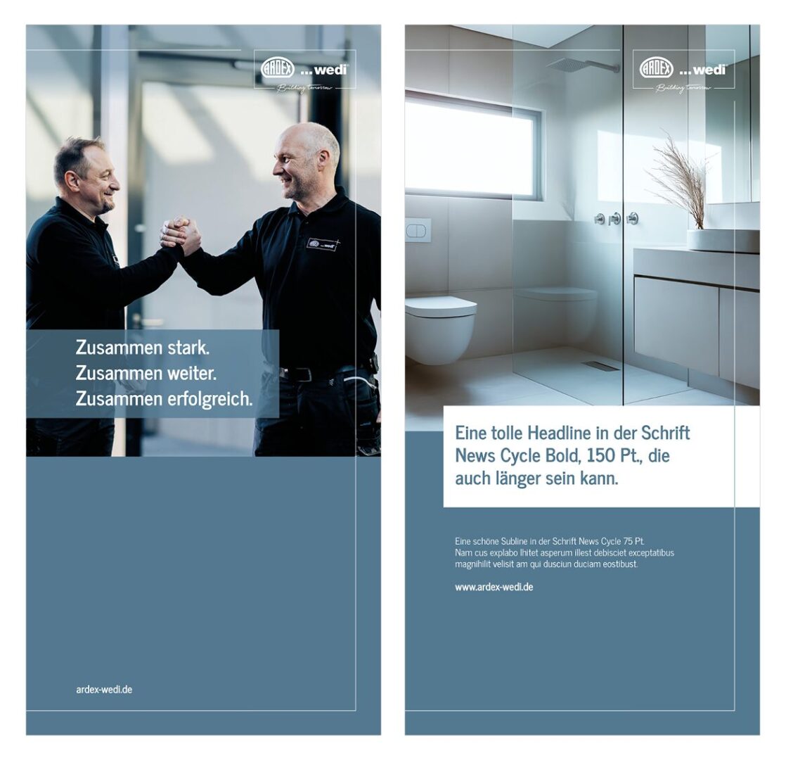
The text is always structured by a headline, a subline and a text area. The text can be arranged in two columns or in a single column. The headline and text are aligned with the grid line. The subline is not. It has a fixed distance from the headline.
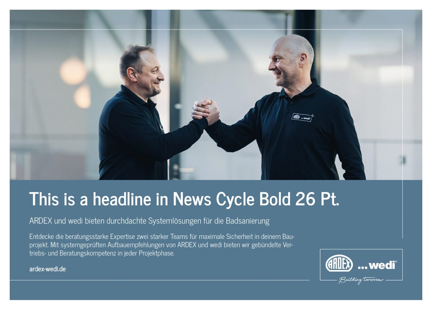
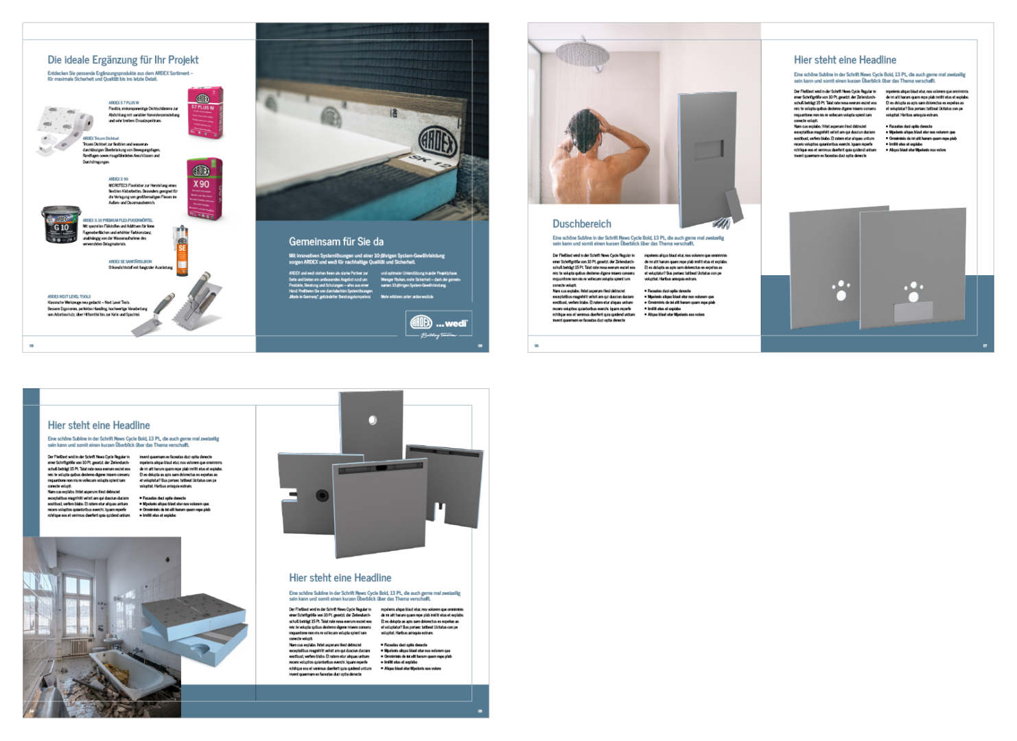
The design offers many creative possibilities and thus allows for creative implementation.

7. LAYOUT FLYER DESIGN

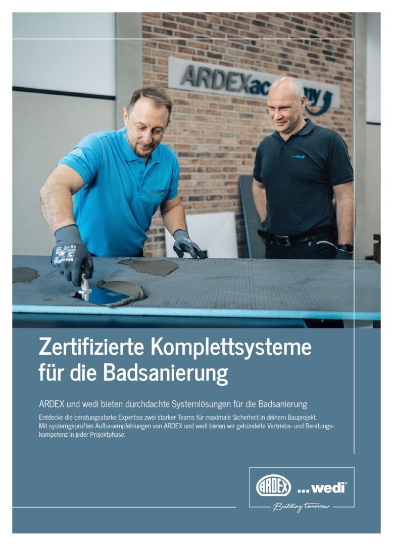
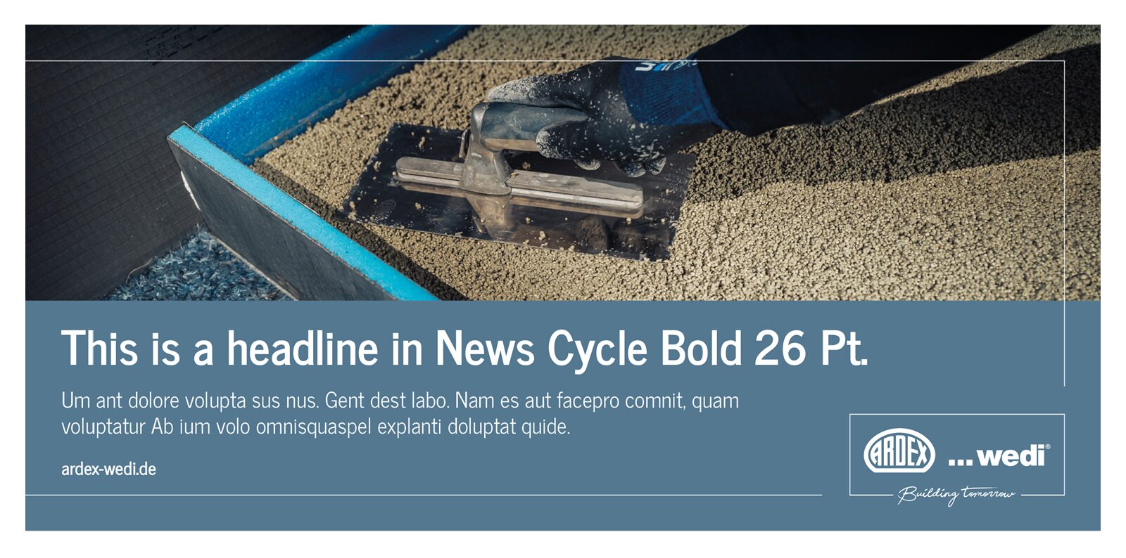
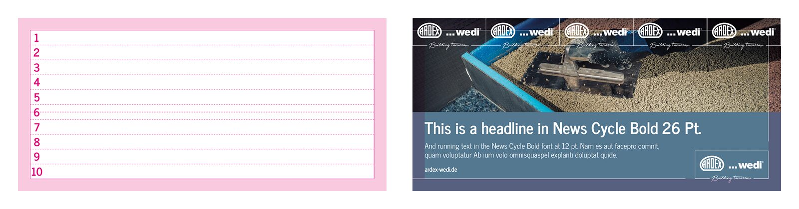
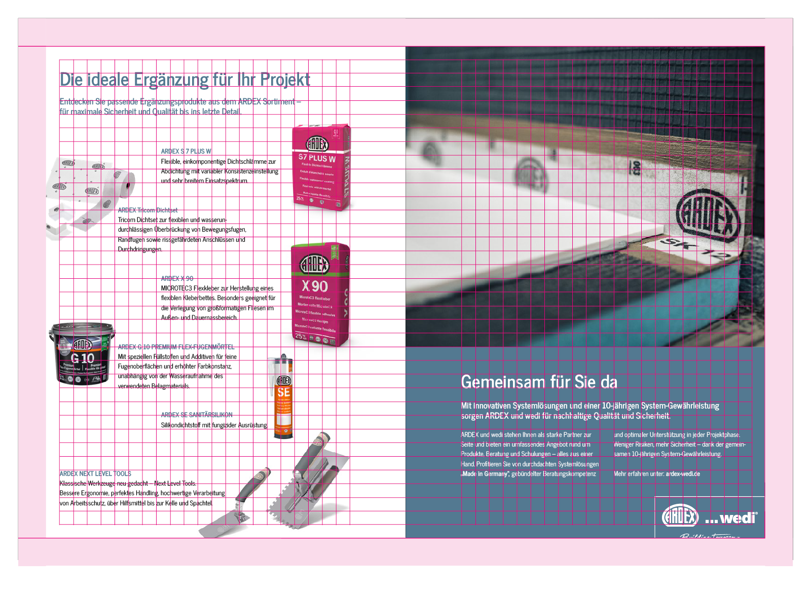
The flyer is structured similarly to the brochure. It features the surrounding frame, the blue areas, and a large image showing the products in use, allowing the viewer to immediately see the result.
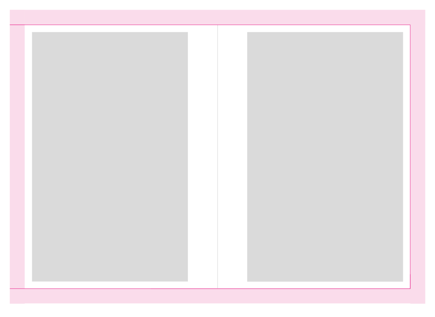
The interior highlights the relevant products as cutouts. Large images of the result demonstrate the quality of the products used. The colour scheme matches perfectly, as it uses the same colour and imagery world.

The layout aligns with the grid. The safe space is smaller compared to the brochure, providing more room for text and images.
There is considerable creative freedom in the layout, as images can be used in all sizes and the amount of text can be adjusted accordingly.

8. LAYOUT Shower Configurator DESIGN

This is the output file of the shower configurator for the customer. The customer has previously configured their needs and then receives this overview.

9. LAYOUT PPT

The PowerPoint presentation contains a total of 30 design templates. In Slide Master view, the individual layouts can be seen.
The templates can be selected within the presentation via the “New Slide” option and added to the presentation.

10. LAYOUT X-Banner

For point-of-sale presentations, two x-banner versions are available: one focuses on brand image, while the other focuses on the product level.

11. LAYOUT Teams Background

Four different backgrounds have been created for Teams. Three of the suggestions are intended for use in the business sector, and one for the technical sector.

Questions or Feedback?

Use the form below to send us your questions, feedback, or to report any issues. We’ll get back to you as soon as possible.